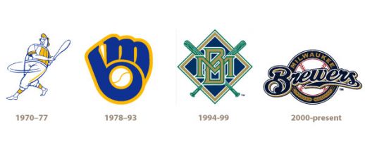
The worst decision in Milwaukee Brewers franchise history, to me, is obvious. It wasn’t any of the team’s myriad poor draft choices or trades or free-agent contracts. No, it wasn’t a baseball move at all. It was the ill-fated decision to ditch one of the greatest logo designs in sports history in 1994, the demise of the m.b. ball-in-glove logo in favor of this dull monstrosity:

I dove into the archives in an attempt to answer the question of how something so absurdly and plainly wrong could be allowed to happen. Rumblings that the Brewers fanbase was growing dissatisfied with the ball-in-glove logo began with a 1989 story in the Milwaukee Journal by Lawrence Sussman, in which he quoted a bunch of Glendale barflies, many of whom couldn’t find the interlocking m and b, and one who called it “a puzzle.” Sussman quotes a cardiologist who preferred the aggressively racist screaming Milwaukee Braves mascot from the 1950s. “That was a good looking Indian,” added the cardiologist.
Sussman’s article offered the conclusion that the ball-in-glove logo was too unprofessional, too childish, not manly enough, and not intimidating enough. The Milwaukee Sentinel’s Bud Lea disagreed in a later column, saying it “may be the most distinctive sports logo of ‘em all,” but the seed was nonetheless planted. For the club’s 25th anniversary in 1994, the ball-in-glove logo was ditched for the interlocking M-and-B logo that lasted until the turn of the millennium and the current Miller-brand inspired look took over.
The 1994 look is austere and cold compared to the cartoonish look of the ball-in-glove logo. The colors are dark and drab, particularly in contrast to the brightness of the Brewers’ previous look. The few people who liked it — just 65 of 301 to call into the Milwaukee Sentinel‘s PressLine gave a positive review — praised its “classiness,” preferring its simplicity to the unorthodox look of the ball-in-glove. But there is a thin line between classy and boring, and most judged the Brewers’ new look to be on the wrong side of that line.
![]()
![]()
“A total of 236 people who phoned in to say they didn’t like the new logo gave a variety of reasons,” Meg Jones of the Sentinel wrote. “It looks like gang symbols, is similar to other teams’ logos, and is difficult to decipher.” The best comment came from Mary Wallace of Fox Point, who told the Sentinel, “I don’t like the new Brewers logo, nor do I like the new Bucks logo. I think you guys must have something going with the Crayola company and the color purple.” Even outfielder Darryl Hamilton joined in with the criticism. “I think the color selection is nice, but I don’t like the idea of changing the logo. I think we have one of the best logos. It’s original. I think changing it is drastic.”
The only way a logo that faced such backlash from day one could have survived is with an unprecedented run of winning from the Brewers. Of course, Milwaukee saw nothing of the sort in the mere six years the redesign lasted. The Brewers finished 424-481 (.468) in that span, never once finishing with a winning record but never losing more than 90 games either. It was a perfectly dull and mediocre stretch, fitting for the look they trotted onto the field.
On February 5th, 1994, the Milwaukee Sentinel published a letter from eight-year old Laura Grube, another Fox Point resident unhappy with the club’s new look. Laura wrote:
“I think the new Milwaukee Brewers’ logo looks too plain. It is also hard to read. It looks too old-fashioned. What’s wrong with the old logo? The old logo was clever. Who in the world made up the new logo?
I guess I’m hard to please, but even my dog agrees. She doesn’t like the new logo either.”
See that, Brewers? Ditching the ball-in-glove made little girls and dogs sad. Way to go, idiots.
1 comment on “The Worst Decision In Brewers History”