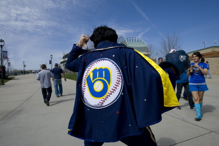
A couple months ago, our own Jack Moore wrote what I believe to be the most accurate article this site has posted: The Worst Decision in Brewers History. He correctly claimed that the organization’s biggest failure was its “ill-fated decision to ditch one of the greatest logo designs in sports history.” The design is perfect; it is both clever and simple, and its m.b. and ball-in-glove duality contains references to the city, the team nickname, and the sport. Not many other logos do all of these, and few do it as well.
Thus, Tuesday’s report from MLB.com’s Adam McCalvy that the team is expandings its use of the ball-in-glove is welcome news. According to McCalvy, the Brewers will wear this new jersey on most Sundays, which means it will be in the regular rotation and we will get the pleasure of seeing it more often than just the occasional retro night.
McCalvy also noted that the ball-in-glove logo will be appearing on the navy blue background that the Brewers’ modern jerseys use, as opposed to the lighter blue that the team wore in the 80s. This is both positive and negative; while part of the allure of the old logo is the bright colors, the fact that they are placing it on the current color scheme suggests that it may become a more permanent part of the team’s ensemble.
These jerseys will also be replacing the gold alternates that the team had been wearing, which is a welcome relief. While they were not quite as bad as San Diego’s Sunday camos, they were still an eyesore and never seemed to match the gray or white pants very well. Other teams appear to have realized this as well, as many teams have adopted darker-colored alternates that contrast much better with their lighter-colored pants (see: Boston’s navy, Colorado’s purple). And though there are of course teams that resist this trend, I am hopeful that this will push even more teams down this road, as this navy blue should provide a cleaner look than the gold did.
With this addition, we are left with a smaller and simpler rotation of uniforms, which McCalvy mentions in his article. The white and gray standard jerseys will presumably remain untouched, with the navy and gold wheat design remaining the team’s primary option. However, the team’s two other uniforms (aside from this new alternate) are the pinstriped retros, which are also great. They contain the retro coloring with the lighter blue that the 80s jerseys and logo featured, and the hat has the ball-in-glove logo.
An additional benefit, if this continues, is that we may be getting a full redesign of the Brewers’ jerseys. The wheat logo is uninspiring, although it isn’t terrible as it does reference the team’s nickname, the city’s history, and the ballpark sponsor. It just does not provide a dynamic look, and it could absolutely be improved upon. At this point, it appears as if more of the jerseys contain the ball-in-glove than the wheat (the three alternates compared to the two standard ones)—although the actual jersey rotation for this year has not been completely confirmed, as all we have to go on is McCalvy’s report. If the Brewers do in fact continue down this road, they should be in for a big aesthetics upgrade.
While I am a fan of the team’s offseason moves from a long-term and strategic perspective, they are realistically unlikely to have much of an impact on the team’s on-field performance this year, so watching them may not be that much more pleasurable an experience. Watching them in this jersey, though, will be a big pleasure, and if this leads to more of this logo in the future, it may very well be the most important decision of this offseason.