The Brewers ended a six-game losing streak thanks to a four-run comeback in the ninth inning Sunday night against the Mariners. If not for a total meltdown from Mariners reliever Tom Wilhelmsen, in which he managed to record just one out and allowed four runs on four hits, including homers, the Brewers would have gone through last week’s road trip winless in seven chances.
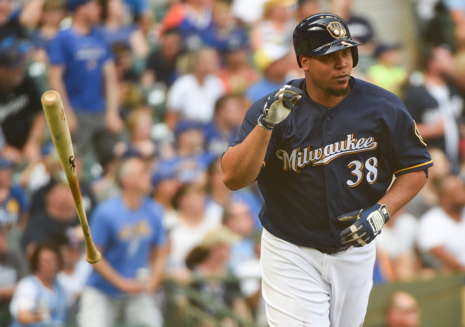
But at least the Brewers were looking good while they were losing in Chicago and Seattle. Every day of the road trip, the Brewers have worn their alternate navy blue uniforms featuring the club’s retro ball-in-glove logo. It’s officially considered an alternate look, but you wouldn’t know it if you’ve been watching the Brewers this season. Through Sunday, Milwaukee has played 61 games on the road. Sunday’s game marked the 45th time the Brewers have used that specific uniform combination on the road already, per the Uniform Diamond Database.
The ball-in-glove logo appeared on the Brewers’ caps just 12 times in all of 2015, with the current capital M primary logo appearing in every other game but one, when the Brewers wore throwback uniforms honoring the Negro Leagues. The club introduced the logo on a navy background in January, and that has served as the logo’s inroad to the club’s regular uniform rotation. Not only has it appeared 45 times on the road, but the club has worn the blue “Milwaukee” alternates with the ball-in-glove logo 23 times at home. It has also appeared 10 times on the club’s home white pinstripe throwbacks.
The ball-in-glove logo has always been popular with Brewers fans, thanks to a combination of its unique design and its connection to the club’s glory days in the 1980s. The current primary logo and color scheme was born out of the club’s move to Miller Park in 2001, and the look reeks of a corporate partnership with the Miller brand. Compared to the team’s 1980s look, the early 2000s logo comes off as bland and overly safe.
When the Brewers made their first playoff appearance in over 25 years in 2008, just the eighth season of the club’s current primary logo, it locked them into that unfortunate look for a few years. Players on those Brewers teams talked about wanting to differentiate themselves from the 1982 American League Championship team, as they wanted to write their own story. It’s difficult to justify a rebrand when fans are buying jerseys and shirseys of successful players on successful teams, not to mention that the overly superstitious mindset of baseball demands you don’t mess with what’s working.
But now the Brewers have been losing for five straight seasons. Whatever attachment fans developed to the look through the 2008 and 2011 playoff runs has surely started to erode after watching five years of losing, and particularly after watching the team’s utter collapse in those jerseys two years ago.
The club’s consistent use of their supposedly alternate looks combined with the retro logo’s presence on holiday uniforms (Father’s Day, Mother’s Day, Fourth of July and Memorial Day) paint a pretty clear picture. As some have been speculating all year, a rebrand of sorts seems to be coming next year, even if it’s just a switch of the ball-in-glove logo from secondary to primary.
Personally, I hope the Brewers make some broader changes. The font they use for uniform numbers is unique in a bad way, a tacky knockoff of Times New Roman. The navy blue they use is too dark and keeps the uniform from popping in the way it did when they used royal blue back in the 1980s. If they use their fun, bright, colorful old look as a starting point, I think they could make something excellent.
But that’s asking for a lot. The ball-in-glove logo is one of the best, most creative looks in sports, and the fact that it’s getting more shine in 2016 is nothing but a good thing. If that trend keeps up into 2017 and the club’s current boring primary logos continue to fade into the background, it will be a major step in the right direction for the club’s aesthetic. Here’s hoping the Brewers stick with it.
1 comment on “The Ball-in-Glove Renaissance”